Saturday 21 July 2007

Latin American Typography

After looking at the blogs of other students (Anna Stratigakis and Caleb Al-Jorani) I found links to work of foreign typographic designers, such as Reza Abedini a Middle Eastern designer. I really appreciated the way that the typography of other languages (especially Arabic) can create beautiful and powerful outcomes. The way the type was used in a symbolic way makes the images evocative and deeply interesting.
This led me to think about other cultures and languages that might also use typography in this way.
After some initial research I found a site called planet typography.com that featured an article by Alejandro Lo Celso, a famous Argentinean typographer, (http://www.planet-typography.com/news/designer/celso.html).
He says, "My work as a type designer, as well as the work of many others in the region, is the work of somebody who believes in this idea of cultural diversity and subversive identities, as the necessary means where interaction between designer and his culture take place.”
He mainly works with old typefaces, reviving them.
“I do think revivalism is a major factor in the evolution of type design.”
This made me think back to our fist year typography design module where I was assigned the typeface Bembo, a typeface that had been redesigned from its renaissance ancestor by Stanley Morrison, who Celso later quotes.
Referring back to the original quote, these fundamental links between a designer and his environment, culture and ethnicity really intrigue me. I then followed links on the page to three different Latin American designers.
http://www.santotipo.com/
http://www.tupigrafia.com.br/
http://www.tipografia.cl/
(Some unfortunately do not have an English version of the site, but you can still appreciate the use of the typography.)


First of all, a project called the Santotipo by Mauro Oliver and Claudio Pousada, with contributions by Javier Bernardo.
The project is “an open enterprise that works for the development of experimentation on typography. It proposes a way to canalize different views on design, focusing on discoveries and development of experimentation on typography.”
Santotipo’s first part is, from folks to fonts. Over one hundred pictures from Argentina, Latin America and Europe. “Surveying spontaneous, accidental or ingenuous design processes on public places.”
These photos capture the integrity and honesty of all the diverse typefaces. The human element makes them charismatic and rich. I also feel that the context in which a typeface is used is extremely important in its overall reception.


The second part is Arranquismo (tearing-off-ism) A review of the urban custom of tearing graphic pieces (posters, notices) from the walls, and a related artistic proposal.


Sunday 8 July 2007

Yanick Dery


Yanick Dery is a world renowned Canadian fashion photographer that I came across after looking at the recent couture line of wedding gown designer Justina McCaffery. Derry shot the photos of her latest collection, “Majestic.”
The black and white images have a theatrical and almost melodramatic feel to them. They looked like shots from a tragic old movie. This style is common within regular couture fashion photography, but it was the first time I have seen it applied so well to the photography of wedding couture. Usually bridal ware photography lacks emotion and can look twee, however, I get the feeling Dery approaches each task with an acute sense of vision. He knows what he wishes to achieve from each shot. The shots are aesthetically pleasing and work not just at face value, but at a deeper level too. The grand setting and high monochrome contrast help to set the mood and create a wistful expressive feel. The irony of the sombre and tragic temper used to advertise something associated with the “happiest day of your life,” for me makes these photos so engaging. Although the photos are over dramatised unrealistic representations of contemporary weddings, they posses a deeper realism that is less obvious at first. For some, a wedding can be an extremely stressful and dramatic ordeal. Whilst other photographers appear to shy away from this, Dery humours it. He creates an intriguing juxtaposition, the dramatic over embellishment that only couture fashion can deliver, with a hint of hidden honesty and wit.


Looking at examples of his other work, you can see this theme continue. I have always appreciated the work of artists whose work has a slightly fictional fancied twist upon it, or work that generally implies some basic storyline instead of just shooting on a plain or uninteresting backdrop, especially in fashion photography. I feel it really helps the clothes to come to life. It makes the work feel more personal and allows photographers to create their own distinct style, whilst making their work more fulfilling to look at.

More Stuff...

After the Tiger Print breif I started messing around on illustrator.

Saturday 7 July 2007

Tiger Print Entry


Bit random. The idea came from a recent holiday photo that came across, I like it because it's different and a bit quirky. (Cheers Sophie for being such a wonderful Model. Ha.)

Vera Wang On Weddings


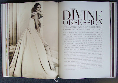
Wedding design has always interested me and I am currently researching the area as a possible career path. When enquiring on the subject at a local wedding store, I was told that no bride, or wedding planner, should begin her wedding process without reading the recent book by Vera Wang, ‘Vera Wang On Weddings’.

Vera Wang, today an established wedding gown designer, took her first major step into the fashion industry as a fashion director for Ralph Lauren, and at 23 became Vogue’s youngest ever fashion editor. Today she continues to design luxury wedding gowns, but has more recently taken to wedding design on a grander scale, catering for couples’ needs from proposal right through to the honeymoon.

The large 10x14 inch pages help to showcase the book’s stunning and picturesque images. The book touches on everything from rings and the reception to the day after. Vera writes with authority but maintains a reassuring and comforting tone whilst explaining every fine detail with such shrewd and insightful words. I found, as someone who is fairly unfamiliar with the industry and process itself, the book highlighted some key issues and areas of wedding design that I would not have contemplated. For example the book runs through the entire order of service and every potential structure a wedding ceremony could possibly follow, making reference to everything from timing to transport and lighting.


From a graphic design point of view, the book is every bit as stunning as the dresses inside - it’s worth a look through just for the images. The precision and attention to detail in the typography mimic the characteristics of Vera Wang’s work. The simple black type on ivory paper, which is thick and silky much like a gown fabric, helps to create a rich, refined and very classic feel. The use of a sheer paper for selected pages allows the image behind to show through, creating the semblance of a veil, again strengthening the book’s tone of voice. Both text and image sit harmoniously alongside one another, neither one battling for the reader’s attention. The use of a serif typeface commands a certain authority and elegance that echoes the tone of voice that a book of this kind should exert. The words appear more judicious and therefore reassuring to the reader, or in many cases, “troubled bride.”

However, although the book is clearly an extremely well informed and reliable source of detailed information for the modern bride, I noticed something else whilst reading it. Although the images are beautiful and rich in colour, they do appear slightly dull. If you look more closely you can see they are all taken in a very soft focus, so soft they almost look slightly grainy; not in a poor quality pixelated way, but in a warm, slightly fuzzy way, much like an old photograph. This was especially noticeable in the large close-up bouquet images. They were hazy and slightly out of focus in comparison to those you may see in a glossy gardening magazine or in contemporary nature photography. Although I expect this effect was chosen to give a more vintage and classic feel, I find it dates the images in a more negative way. Is this an American thing? It certainly didn’t feel European. What made it strange to me, was the combination of such advanced typography with the slightly hazy and dated images. It was an intriguing juxtaposition. Looking through fashion magazines such as Vogue, I notice that other American designers such as Ralph Lauren also use this type of effect within their advertisements and that European designers use much brighter, bolder, crisper images and will rarely use cream or ivory as a background colour.

Wednesday 4 July 2007

The Chemical Brothers do it again.


After watching Babel I saw the Chemical Brothers video for their new single “Do it again,” and noticed some similarities… coincident or not? In the video two young Moroccan brothers leave their normal lives after coming across tape. When the tape is played it plays “do it again” by the Chemical Brothers. The song seems to evoke uncontrollable and sporadic movement in those who hear it. The brothers take the tape to a nearby village and let the havoc unfold. The two Moroccan boys and the setting of the video are very similar to that in Babel, although this video is much happier and the events are far less unsettling. The video is light-hearted and fun.

This chemical brothers video is also extremely similar to an older video for the Fat Boy Slim single, “Ya Mama.” In this version three hill billy American simpletons stumble across an identical white tape. This video is also set somewhere in Africa, perhaps Zimbabwe or South Africa. The video follows a similar format, the tape is played and the music causes its listeners to move erratically, creating chaos throughout the town. In both cases this new urban and dynamic music is taken to a rural area of a developing country where music is more limited.
What I liked about both these videos was the attempt to bridge the gap between the cultures, showing that people of different races and cultures can all enjoy the same music, even if it is not stereotypical of there nation. The way the people in the video move also reinforced this. The strongest element was the head nodding. This simple repetitive movement helps people to bridge the gap and relate back to their own culture, even as I listened I found myself nodding along to the songs contagious beat. I found the comic element to both videos uplifting; it was nice to see these countries portrayed more positively within western media.


To see both videos visit
http://www.youtube.com/watch?v=xidZW3x8AGo
http://www.youtube.com/watch?v=8WCJZjdP-eQ

Babel

As a “small” Brad Pitt fan I took it upon myself to watch his latest film Babel. Unsure as to what to expect from the Hollywood doyen, I decided to give it a watch.
It’s fair to say that it’s no feel good film, but it does shine light on some issues that we can all relate to. Not so much the shooting of busses or crashing through international borders, but that sometimes we all feel unheard and need to be listened to, regardless of age, race or religion. Although the stories are set all over the globe, from Mexico to Morocco and out to Japan, the way they link together enhances one strong theme, the need for international understanding. This is reinforced by the films references to the global issue of terrorism, and highlights the cultural ignorance that is associated with it.
It has some disturbing scenes that evoke a variety of contrasting emotions, such as guilt, sorrow, disbelief and understanding to name a few. Each character slowly becomes lost (emotionally or physically) in a place they don’t know or can’t understand. So much seems to happen as the film continuously jumps between its three main story lines, exploring the character relationships, whilst slowly allowing clues and answers to filter through to the audience.
As the story continued to weave together the three extremely diverse environments, it began to create a unity that reminds us of just how small the world is and how our actions affect others. I felt the film was trying to get us to understand that although sometimes we feel so insignificant and unheard, we are all responsible for our behaviour and can all make a difference.
Although it appears to deal with some vast subject areas like cultural ignorance, politics and terrorism to name but a few, I felt these issues did not distract from the individual characters stories, or the general message of the film. It merely used them as a contextual aid in which to highlight the problems with modern civilization, with the hope that the audience would give some thought to these issues once the film had ended.
Overall I found Babel to be thought provoking and intense film with strong characters, depth, integrity and an underlying message echoed through its title, ignore the babble and to listen to each other.

Tuesday 3 July 2007

Mitchell and Webb take over Mac


I really enjoyed watching the recent Mac adverts with Mitchell and Webb (aka the stars of Peep show). These adverts have been running for over a year in US where they follow the same format but feature the actors Justin Long and John Hodgman who you might recognize from the film Dodge Ball. Mac has also recreated the ads for a Japanese market.
The idea behind the averts is to try and persuade people to make the switch from PCs to Macs. This is done by cleverly highlighting the strengths of a Mac against the weaknesses of a PC through various different everyday scenarios faced by computer users.
I feel casting Mitchell and Webb as Mac and PC does have its advantages. The British public are already familiar with the two actors and the characters they play within the incredibly successful “Peepshow.” At first this seemed like the perfect match, Mitchell, aka “Mark,” the unattractive, dull, office working PC, and Webb, aka “Jez,” the somewhat cooler, more laid back Mac. However, if you think about it Jez’s character doesn’t really promote the trustworthy, reliable and practical image that Mac is trying create here. He’s a bit of a lay about and is in fact just as much of a loser as his friend Mark.
But generally I think the concept works. The adverts are funny and do highlight some pretty genuine issues that could easily influence someone buying a computer.

Visit http://www.apple.com/uk/getamac/ads/ to see the full series of Mitchell and Webb adverts, or http://www.apple.com/getamac/ads/ to see the US versions. Enjoy.