Wedding design has always interested me and I am currently researching the area as a possible career path. When enquiring on the subject at a local wedding store, I was told that no bride, or wedding planner, should begin her wedding process without reading the recent book by Vera Wang, ‘Vera Wang On Weddings’.
Vera Wang, today an established wedding gown designer, took her first major step into the fashion industry as a fashion director for Ralph Lauren, and at 23 became Vogue’s youngest ever fashion editor. Today she continues to design luxury wedding gowns, but has more recently taken to wedding design on a grander scale, catering for couples’ needs from proposal right through to the honeymoon.
The large 10x14 inch pages help to showcase the book’s stunning and picturesque images. The book touches on everything from rings and the reception to the day after. Vera writes with authority but maintains a reassuring and comforting tone whilst explaining every fine detail with such shrewd and insightful words. I found, as someone who is fairly unfamiliar with the industry and process itself, the book highlighted some key issues and areas of wedding design that I would not have contemplated. For example the book runs through the entire order of service and every potential structure a wedding ceremony could possibly follow, making reference to everything from timing to transport and lighting.

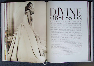
From a graphic design point of view, the book is every bit as stunning as the dresses inside - it’s worth a look through just for the images. The precision and attention to detail in the typography mimic the characteristics of Vera Wang’s work. The simple black type on ivory paper, which is thick and silky much like a gown fabric, helps to create a rich, refined and very classic feel. The use of a sheer paper for selected pages allows the image behind to show through, creating the semblance of a veil, again strengthening the book’s tone of voice. Both text and image sit harmoniously alongside one another, neither one battling for the reader’s attention. The use of a serif typeface commands a certain authority and elegance that echoes the tone of voice that a book of this kind should exert. The words appear more judicious and therefore reassuring to the reader, or in many cases, “troubled bride.”


 However, although the book is clearly an extremely well informed and reliable source of detailed information for the modern bride, I noticed something else whilst reading it. Although the images are beautiful and rich in colour, they do appear slightly dull. If you look more closely you can see they are all taken in a very soft focus, so soft they almost look slightly grainy; not in a poor quality pixelated way, but in a warm, slightly fuzzy way, much like an old photograph. This was especially noticeable in the large close-up bouquet images. They were hazy and slightly out of focus in comparison to those you may see in a glossy gardening magazine or in contemporary nature photography. Although I expect this effect was chosen to give a more vintage and classic feel, I find it dates the images in a more negative way. Is this an American thing? It certainly didn’t feel European. What made it strange to me, was the combination of such advanced typography with the slightly hazy and dated images. It was an intriguing juxtaposition. Looking through fashion magazines such as Vogue, I notice that other American designers such as Ralph Lauren also use this type of effect within their advertisements and that European designers use much brighter, bolder, crisper images and will rarely use cream or ivory as a background colour.
No comments:
Post a Comment